Free Online
Responsive Web Design Courses and Certifications
Build mobile-friendly websites that adapt seamlessly across devices using HTML5, CSS3, and modern layout techniques like Flexbox and Grid. Learn through hands-on projects on freeCodeCamp, Coursera, and YouTube, mastering fluid grids, flexible images, and media queries for optimal user experiences.
Learners also browse
Showing 1,148 courses
Filter by
Filters
-
-
Level
-
Duration
-
Language
-
-
- CodeSignal
- 2 hours
- Self-Paced
- Free Certificate
-
- CodeSignal
- 3 hours
- Self-Paced
- Free Certificate
-
- OpenLearning
- Self-Paced
- Paid Course
-
- OpenLearning
- Self-Paced
- Free Online Course
-
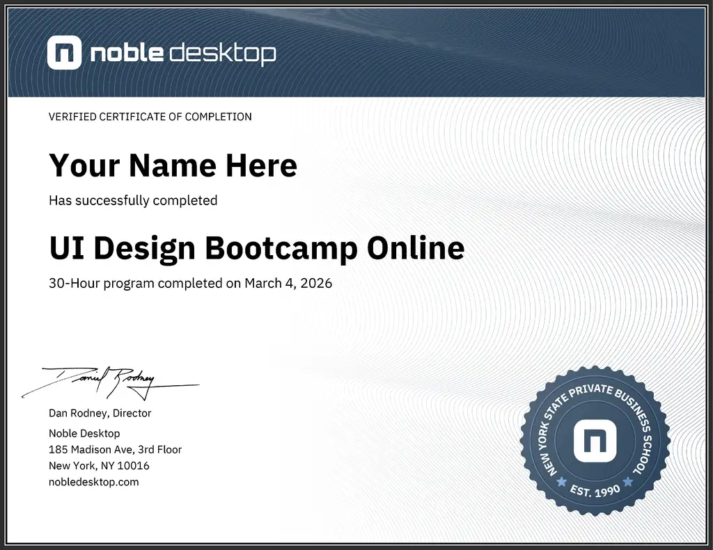
- VDCI
- 30 hours
- Self-Paced
- $1,695.00
-
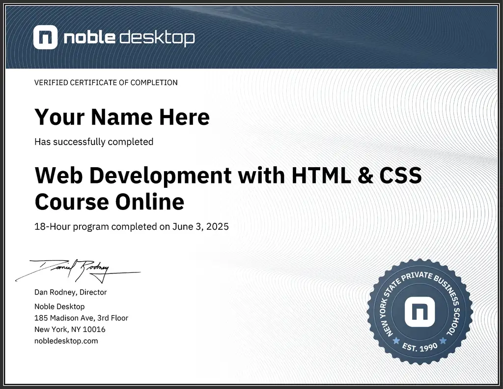
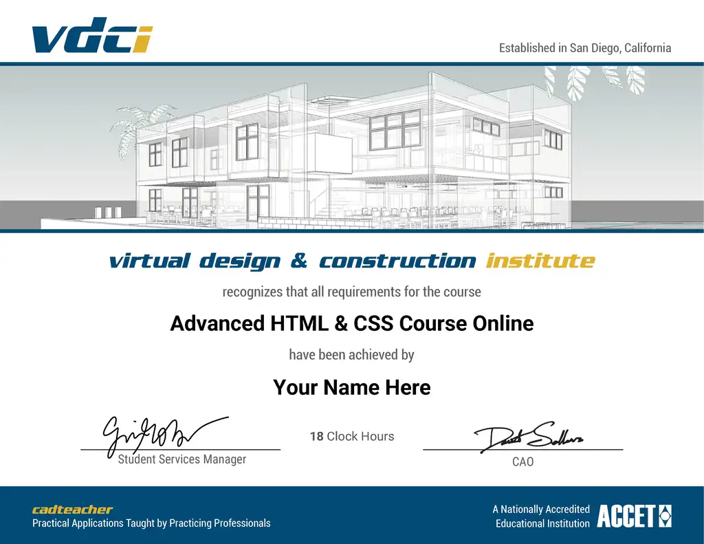
- VDCI
- 18 hours
- Self-Paced
- $975.00
-
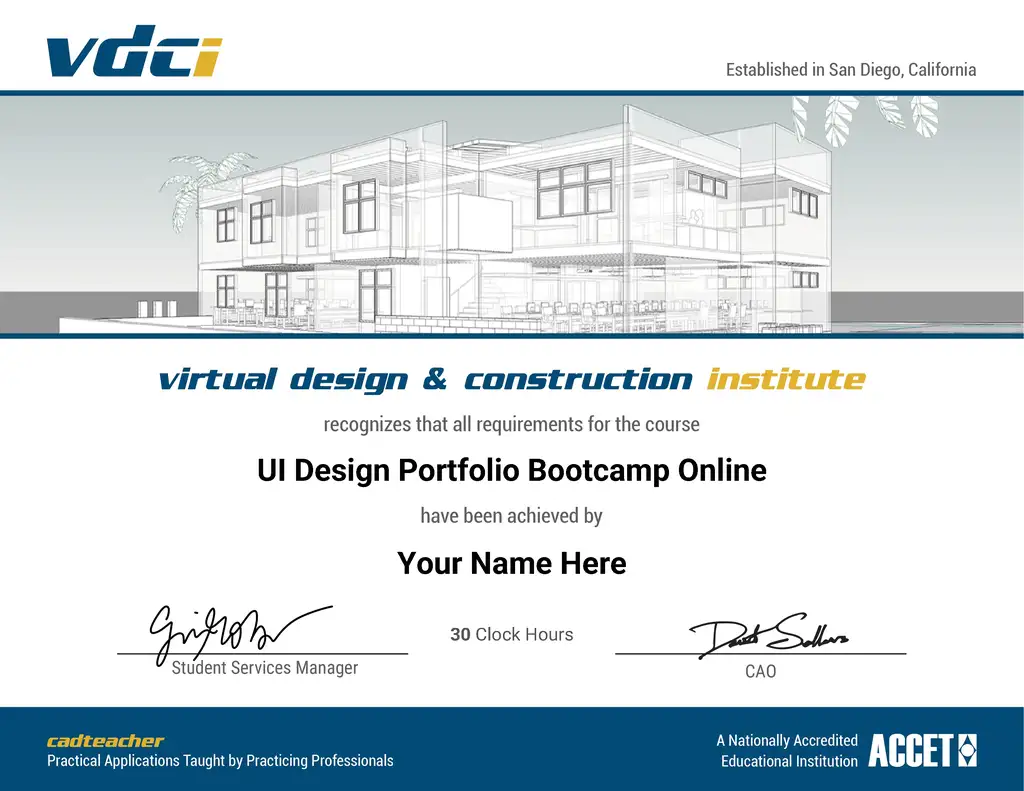
- VDCI
- 30 hours
- Self-Paced
- $1,695.00
-
-
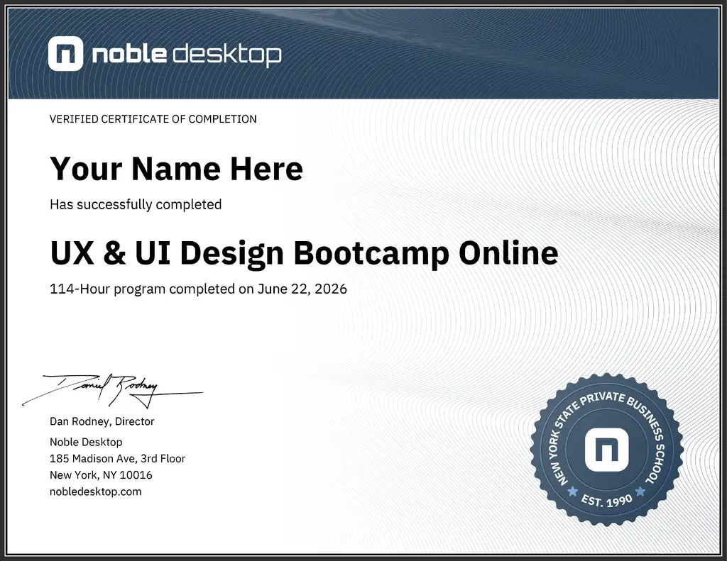
- VDCI
- 114 hours
- Self-Paced
- $2,995.00
-
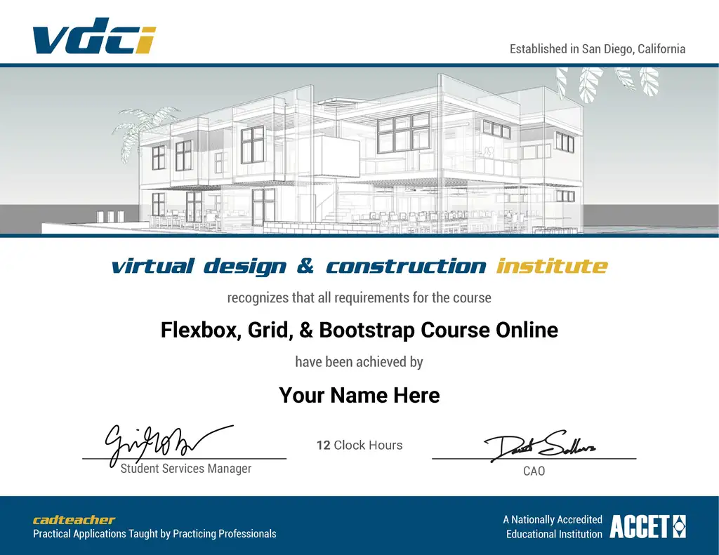
Compare Flexbox and Grid for responsive webpage layouts, then streamline layout work with Bootstrap.
- VDCI
- 12 hours
- Self-Paced
- $650.00
-
- VDCI
- 18 hours
- Self-Paced
- $975.00
-
- Coursera
- 4 weeks, 4 hours a week
- Self-Paced
- Paid Course
-
- Coursera
- 3 weeks, 4 hours a week
- Self-Paced
- Paid Course
-
- Coursera
- 3 weeks, 10 hours a week
- Self-Paced
- Paid Course
-
- CourseHorse
- 200 hours
- Self-Paced
- $3,500.00
-
- CourseHorse
- 200 hours
- Self-Paced
- $4,500.00
-